16/9/2022
How To Make A Good Website — Or: The Verge's Redesign
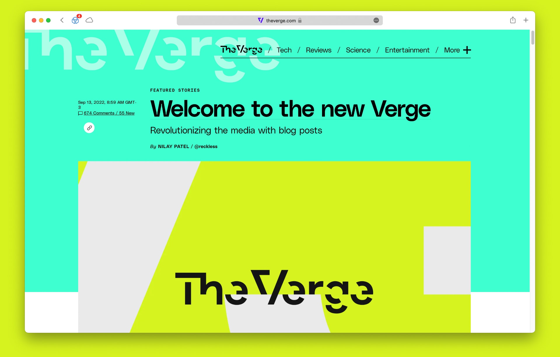
I tried to stop myself, but I couldn’t: over the past few days, I have spent way more time than would be healthy reading the comments on the post in which the US tech website The Verge announced its latest radical redesign.
With a bold new look, bright colors, and notes that link out, the goal, according to editor-in-chief Nilay Patel, is to “revolutionize the media with blog posts.”
A very noble cause and one that has my full support, but it seems that its new fancy look have not been well received by Verge’s most voracious readers.
Nilay states in the announcement that “sometimes you just have to blow things up and start over.” Perhaps this was not the case for The Verge, a reference site in consumer technology, the source which almost all sites covering this area drink from.
The Verge’s home page, the most widely read of the Vox Media conglomerate, has become quite… different. Besides their original reporting and takes, it now has little boxes with links to other sites and bits of social networks (Twitter, Reddit, TikTok) embedded. They are grouped in a thing (?) called the StoryStream.
It’s a quirky layout. Sometimes the content is on the left, sometimes on the right, the original reporting mixed with the little notes with external links; more than once, I noticed a story both in the StoryStream and published as an original post. And it’s heavy. Each Tweet or TikTok video is an entire extra page loaded inside the one you are on. The people there can’t help themselves either. A couple days ago Nilay posted an 11 MB animated GIF on The Verge’s home page.
To Axios, the editor-in-chief said that the new Verge is the result of the idea that, today, it doesn’t compete with other publications, such as Wired or the New York Times. “Our competition is Twitter and other aggregators of audience.”
Maybe the problem is that they have drawn too much inspiration from these new competitors. Let’s face it, Twitter is not a design paradigm for anyone, much less for an editorial site.
A comment that resonated a lot among readers, aside from complaints of ruined pupils and the feeling of disorientation on the home page, is that if they wanted to read Twitter posts, they would go to Twitter.
Redesigns of this kind interest me for several reasons: I love the web, I have a product that I subject to similar redesigns once in a while, and on a deeper level I like to think about information flows and the best ways to communicate in text.
The new The Verge looks like something out of the mind of Joshua Topolsky, one of the co-founders who long ago went down other paths and now heads the equally confusing Input Magazine. It is form over function, aesthetics drawing attention where it should be transparent.
It’s been in my mind that this problem has been solved for a good few years, maybe decades, especially within the premise presented by Nilay that the new Verge wants to “revolutionize the media with blog posts.”
What is a blog if not a long list of posts displayed in reverse chronological order?
The Verge’s redesign must have been driven by something else. In his post, Nilay declines to debate this, saying that such work attracts questions about conversion metrics and KPIs and “other extremely boring vocabulary words.” Instead, he goes on, the only goal here is that The Verge should be fun to read, every time you open it.
I disagree somewhat with his statement, particularly when it comes to “a giant site that makes a bunch of money” (his words). The fact that we are drowned in trackers and intrusive and abusive ads on the web, which makes it toxic if you are not behind a good ad blocker, is because of the direct influence of these “extremely boring vocabulary words.”
Were it not for this, we would have more editorial/content sites like my Manual do Usuário (Portuguese) or the “lite” version of CNN — I mean, less flashy, yes, but way more readable, organized, and really lightweight.
Topolsky, the former editor-in-chief of The Verge with a penchant for lysergic layouts, had a brief stint at the traditional Bloomberg. It’s been said that his bold ideas were met with resistance from the publication’s management, which led to an inevitable clash, and ultimately to his premature departure before completing a year in the job.
In every publication, the comment space represents a tiny slice of the audience, not infrequently with loud but distinct opinions from the majority. This perhaps hides a better reception of The Verge’s new look. Or maybe it doesn’t. From the volume and intensity of complaints, which I’ve been eagerly reading since new layout’s day one, I’d bet on at least some changes to the home page, to something softer and more traditional.
On Twitter, Nilay Patel boasted that they “made everyone talk about a open web redesign in 2022.” True, see us here, still talking about it. He also said, in the same post and as if it were a testament to quality, that The Verge’s home page had double the average traffic on the launch day. True too, but I don’t know if this is positive. Every catastrophe attracts a lot of curious eyes.
Discuss @ Hacker News.