27/9/2022
It would be great to start the day with a personalized newsletter — not by an algorithm, but by ourselves. With news from our area, latest posts from our favorite websites, Twitter summaries, and more.
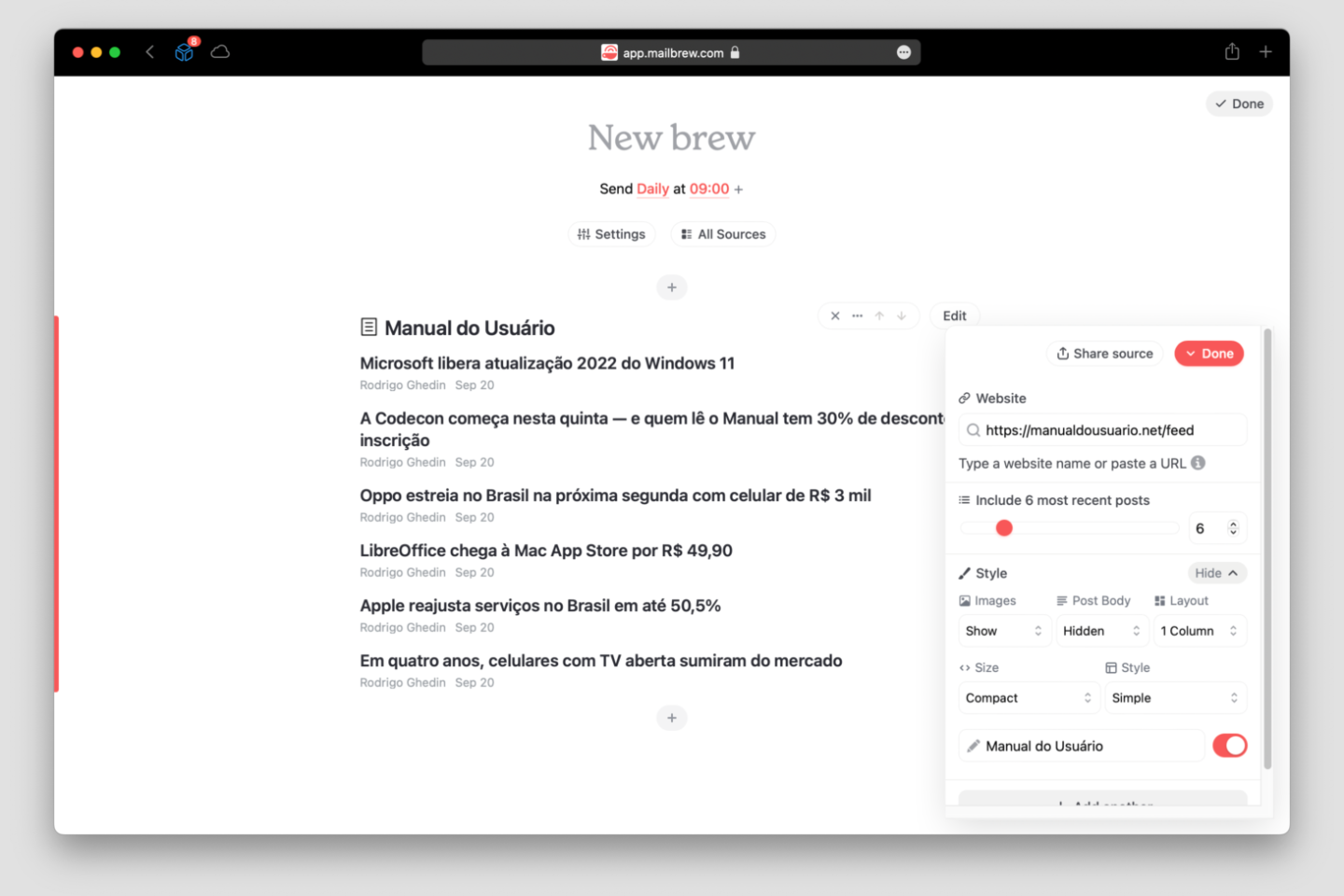
Mailbrew, a service I recently discovered, allows this. After registering (using an email or a Twitter account), you see a screen where can create “brews”, which is what they call the digest/newsletters — you can create several if you want.
It’s very intuitive. The first step is to define the periodicity of the e-mail (daily, weekly or monthly) and the time you want it to arrive in your inbox.
After that the fun begins. A wall of information source buttons appears. Just click on the desired one and adjust its settings. Some, like Twitter’s, contain many settings, which helps refine the content selection. There are also visual settings, to display more or fewer images in emails.
After setting your “brew” up, click the Done button in the upper right corner. At this point you will receive the first issue of your newsletter, and from then on, the next ones will drop into your e-mail in the established periodicity — which can be changed at any time, by the way.
Mailbrew also has two other features: one for reading newsletters within its web interface (it gives you a special email address for this) and another for saved/read-it-later articles (like Pocket or Instapaper).
They are nice features, but inferior to other apps specific to these purposes. The best of it is the personalized newsletter. And the good thing? Mailbrew is free.
Discuss @ Hacker News.
16/9/2022

I tried to stop myself, but I couldn’t: over the past few days, I have spent way more time than would be healthy reading the comments on the post in which the US tech website The Verge announced its latest radical redesign.
With a bold new look, bright colors, and notes that link out, the goal, according to editor-in-chief Nilay Patel, is to “revolutionize the media with blog posts.”
A very noble cause and one that has my full support, but it seems that its new fancy look have not been well received by Verge’s most voracious readers.
Nilay states in the announcement that “sometimes you just have to blow things up and start over.” Perhaps this was not the case for The Verge, a reference site in consumer technology, the source which almost all sites covering this area drink from.
The Verge’s home page, the most widely read of the Vox Media conglomerate, has become quite… different. Besides their original reporting and takes, it now has little boxes with links to other sites and bits of social networks (Twitter, Reddit, TikTok) embedded. They are grouped in a thing (?) called the StoryStream.
It’s a quirky layout. Sometimes the content is on the left, sometimes on the right, the original reporting mixed with the little notes with external links; more than once, I noticed a story both in the StoryStream and published as an original post. And it’s heavy. Each Tweet or TikTok video is an entire extra page loaded inside the one you are on. The people there can’t help themselves either. A couple days ago Nilay posted an 11 MB animated GIF on The Verge’s home page.
To Axios, the editor-in-chief said that the new Verge is the result of the idea that, today, it doesn’t compete with other publications, such as Wired or the New York Times. “Our competition is Twitter and other aggregators of audience.”
Maybe the problem is that they have drawn too much inspiration from these new competitors. Let’s face it, Twitter is not a design paradigm for anyone, much less for an editorial site.
A comment that resonated a lot among readers, aside from complaints of ruined pupils and the feeling of disorientation on the home page, is that if they wanted to read Twitter posts, they would go to Twitter.
Redesigns of this kind interest me for several reasons: I love the web, I have a product that I subject to similar redesigns once in a while, and on a deeper level I like to think about information flows and the best ways to communicate in text.
The new The Verge looks like something out of the mind of Joshua Topolsky, one of the co-founders who long ago went down other paths and now heads the equally confusing Input Magazine. It is form over function, aesthetics drawing attention where it should be transparent.
It’s been in my mind that this problem has been solved for a good few years, maybe decades, especially within the premise presented by Nilay that the new Verge wants to “revolutionize the media with blog posts.”
What is a blog if not a long list of posts displayed in reverse chronological order?
The Verge’s redesign must have been driven by something else. In his post, Nilay declines to debate this, saying that such work attracts questions about conversion metrics and KPIs and “other extremely boring vocabulary words.” Instead, he goes on, the only goal here is that The Verge should be fun to read, every time you open it.
I disagree somewhat with his statement, particularly when it comes to “a giant site that makes a bunch of money” (his words). The fact that we are drowned in trackers and intrusive and abusive ads on the web, which makes it toxic if you are not behind a good ad blocker, is because of the direct influence of these “extremely boring vocabulary words.”
Were it not for this, we would have more editorial/content sites like my Manual do Usuário (Portuguese) or the “lite” version of CNN — I mean, less flashy, yes, but way more readable, organized, and really lightweight.
Topolsky, the former editor-in-chief of The Verge with a penchant for lysergic layouts, had a brief stint at the traditional Bloomberg. It’s been said that his bold ideas were met with resistance from the publication’s management, which led to an inevitable clash, and ultimately to his premature departure before completing a year in the job.
In every publication, the comment space represents a tiny slice of the audience, not infrequently with loud but distinct opinions from the majority. This perhaps hides a better reception of The Verge’s new look. Or maybe it doesn’t. From the volume and intensity of complaints, which I’ve been eagerly reading since new layout’s day one, I’d bet on at least some changes to the home page, to something softer and more traditional.
On Twitter, Nilay Patel boasted that they “made everyone talk about a open web redesign in 2022.” True, see us here, still talking about it. He also said, in the same post and as if it were a testament to quality, that The Verge’s home page had double the average traffic on the launch day. True too, but I don’t know if this is positive. Every catastrophe attracts a lot of curious eyes.
Discuss @ Hacker News.
9/9/2022
After presenting us to the medical terrorism, once again reinforced at its “Far Out” event earlier this week with another batch of Apple Watch users saved by their watches from heart attacks and… bears (?), Apple’s marketing has expanded the types of terrorism it subjects consumers to in its eagerness to sell more phones and watches.
Let’s start with existential terrorism. Priced from USD 799, the newly announced iPhone 14 is capable of sending SOS messages to satellites, even in places where there is no carrier signal or any Wi-Fi network nearby.
Without an iPhone 14, Apple threatens, what will you do when you find yourself lost in the middle of nowhere?
Later on, Apple introduced us to car terrorism. The new Apple Watch and iPhones have a unique feature that can detect car crashes and call emergency automatically.
The company claims that many accidents happen in remote areas and involve only one car, which means that if you don’t have the latest iGadget, you are in danger of dying alone, agonizing inside your car.
There is something different on Apple’s storytelling. Their classic ideal consumer, that happy person who takes pictures of their friends at fancy parties and goes on vacations in heavenly landscapes, has given way to a myriad of personas, from the paranoid who think they will die around the next corner if they don’t have an Apple Watch on their wrist to those who aspire to be something “Pro” without going to the hassle that is generally expected of someone considered “Pro”.
Take the Apple Watch Ultra, the new version of the company’s watch focused on adventurers, an audience that until now was better served by rival Garmin. With a more robust finish, a larger battery, and features designed for extreme situations, the Ultra is, as someone jokingly commented, an Apple Watch for ten people in the world — those who participate in Iron Man, who climb the Mount Everest, who cross the Sahara on foot.
Of course, Apple doesn’t expect to sell just ten units of the Apple Watch Ultra. It has equal or more appeal to a much larger audience — those who would like to be more adventurous, who plan or even go for longer walks from time to time, who aspire to be like the characters in the top-notch commercial Apple prepared to sell a USD 799 watch that will be outdated next year.
The new super camera of the iPhone 14 Pro/Pro Max, with 48 megapixels and several “cinema” features, is another example of aspirational functionality.
No matter how good a phone camera is — and I truly believe they are the best for most people —, it is hard to imagine a professional photographer or movie studio discarding their huge and expensive cameras to use an iPhone, even a “Pro” iPhone. For those for whom camera quality makes a difference, any iPhone released in the last five years makes good enough pictures.
It is no longer enough to just flaunt an iPhone, an indictment of ~haters that has been made since forever, a claim theorized by Thorstein Veblen, who christened this behavior “conspicuous consumption” in the late 19th century, long before Steve Jobs took the stage to announce the first iPhone in 2007.
The real upgrade of the iPhone is its transformation from a status symbol into a (supposed) lifesaver and a prism that reflects multiple aspirations of its owner: someone concerned about health, someone adventurous, a person sensitive enough to notice insignificant aesthetic subtleties and value photography as art.
Even the purchase itself imbues an aspirational element, of someone who cares about the climate emergency. For each new product it announces, Apple throws on the screen a bunch of data and promises to “decarbonize” its production line by 2030, a fallacy that justifies greedy and hostile attitudes to the consumer, such as removing the wall charger from the iPhone box, and sweeps under the rug practices much more aggressive to the environment as hindering the reuse of components (another terrorism, this one commercial), discontinuing support for perfectly capable products and preventing the rescue of discarded equipment.
In Apple’s eyes, the ideal owner of an Apple Watch Ultra and/or an iPhone 14 Pro is like that driver who thinks he needs a huge pickup truck or SUV, even if he only drives from home to office, office to home, and never hits a dirt road. (Related note: the ranking of best-selling cars in the United States is dominated by huge pickup trucks and SUVs.)
While justifying its annual release cycle with complex craziness of extremely limited use, Apple has to deal with more pressing and mundane issues, such as the global recession and the stagnant phone market that threaten its market value. These things are closely related.
iPhone prices have risen everywhere except in the United States. The end of the “mini” version and the arrival of the iPhone 14 Plus increase the average selling price of the line and concentrate it even more in the top range market, which is immune to any crisis and has always had fat margins, and that still growing, Apple in the lead.
The strongest sign of Apple’s effort to sell more of its most expensive iPhones is the unprecedented distinctions between the Pro and regular iPhone 14 lines.
For the first time, the new iPhones use different chips. The new one, the A16 Bionic, was reserved for the Pro line. The regular iPhone 14 reused the same 2021 A15 Bionic used in the iPhone 13. For all intents and purposes, except for the Plus model’s huge screen, the iPhone 14 is almost indistinguishable from the iPhone 13.
Nothing better represents this Apple effort, however, than the “Dynamic Island”, the marketing name for the interactive animations that play with the new cutout in the screen that houses the Face ID sensors and front camera.
The same notifications displayed on “Dynamic Island” exist on every iPhone in use, but only on the iPhone 14 Pro and Pro Max are they so pleasing, so “creative,” a show apart.
Instead of hiding it, Apple rubs the cutout in the user’s face. Is it cool? Yes, very. And genius too, a testament to Apple’s unparalleled mastery of the art of making cool phones.
Android manufacturers have spent years using the same kind of cutout in the screen for the front camera. They had plenty of time to come up with something cool like this. The best they came up with? A few static Galaxy S10 wallpapers that incorporate the cutout. That you don’t remember this is no accident.
Nonetheless, Dynamic Island is — I repeat — a preciosity that helps to justify phones that cost USD 1,000 or more in the face of other devices, including some from the same company, that do the same things and cost up to 70% less.
The various terrorisms of Apple’s marketing, the new products’ features that serve tiny groups of consumers treated as essential, even the smoke signal, I mean, the satellite signal available in the very rare event that you get lost in the woods, all this hides an inconvenient truth for the industry, for Apple: our phones, the ones we already have, already in use, are very, very good.
Discuss @ Hacker News.
6/9/2022
Brazil’s Ministry of Justice forbid Apple from selling iPhones in the country due to the lack of wall charger in the phone’s box and fined the company in BRL 12 million (~USD 2,3 million).
Senacon, a consumer secretary of Ministry of Justice, said on its decision, published this Tuesday (Sep. 6th), that Apple infringed consumer laws when it removed the wall charger from iPhone 12 onwards, starting in 2020.
All iPhone models are forbidden to be sold in Brazil. Senacon also asked Anatel, Brazilian communications regulatory agency, to cancel all iPhone models certifications of conformity in the country.
Senacon also asked for help of Ministry of Foreign Affairs to broadcast today’s decision to European Union, United States, and other countries of South America.
Read the decision here (in Portuguese).
3/9/2022
People say that “early adopters”, those consumers willing to be the first to buy or try a new product, only get screwed. By submitting themselves to things not yet tested by more people, they are exposed to the risk of design errors, failures in the manufacturing process, high costs etc.
Such cases are so frequent in the industry that waiting is considered good practice. Instead of buying at launch, wait. In the worst case scenario, you can avoid walking around with a phone-shaped bomb in your pocket, as happened to the early adopters of Samsung’s Galaxy Note 7 in 2016.
Some changes, however, reach all adopters, early or late, those who wait for the trendiest product to become obsolete. Take my case: seven years after Apple retired the diversity of ports on its laptops, replacing them with just one type — the USB-C/Thunderbolt —, I felt the impact of this “evolution” on my skin, or rather, in my pocket.
An evolution, I must say, that has already been reversed in the company’s most expensive line of laptops. The 2021 MacBook Pro brought back the MagSafe connector, the HDMI port, and the SD card slot. On its cheaper models, we still have to make deal with a few USB-C/Thunderbolt ports and countless adapters.
I’m not saying that USB-C/Thunderbold is bad. It is actually quite handy to plug and unplug just one cable on my desk when switching between “laptop” and “workstation” modes. To the USB-C hub I connect keyboard, mouse, and monitor — sometimes my headphones, a pen drive, a Yubikey, and a SD card, none of them having a USB-C plug. Before, there were at least three cables that I had to plug and unplug all the time; now it’s just one.
But these things doesn’t need to be mutually exclusive. Apple could, for instance, keep a USB-A port next to the USB-C ones, which would save me from having to carry an adapter for when, in “laptop mode,” I need to use a flash drive or my Yubikey
(Note, by the way, that even the 2021 MacBook Pro full of ports doesn’t have a USB-A, a format sentenced to death by Apple, but still widely used.)
With phones, the drama was similar. Under the pretext of “saving the environment,” as if there was nothing better to be done in this regard, in 2020 Apple removed the wall charger from the boxes of the iPhone.
In the company’s official store, that 5W charger that used to be “free” is sold for USD 19. Interestingly, the 20W USB-C model comes out at the same price.
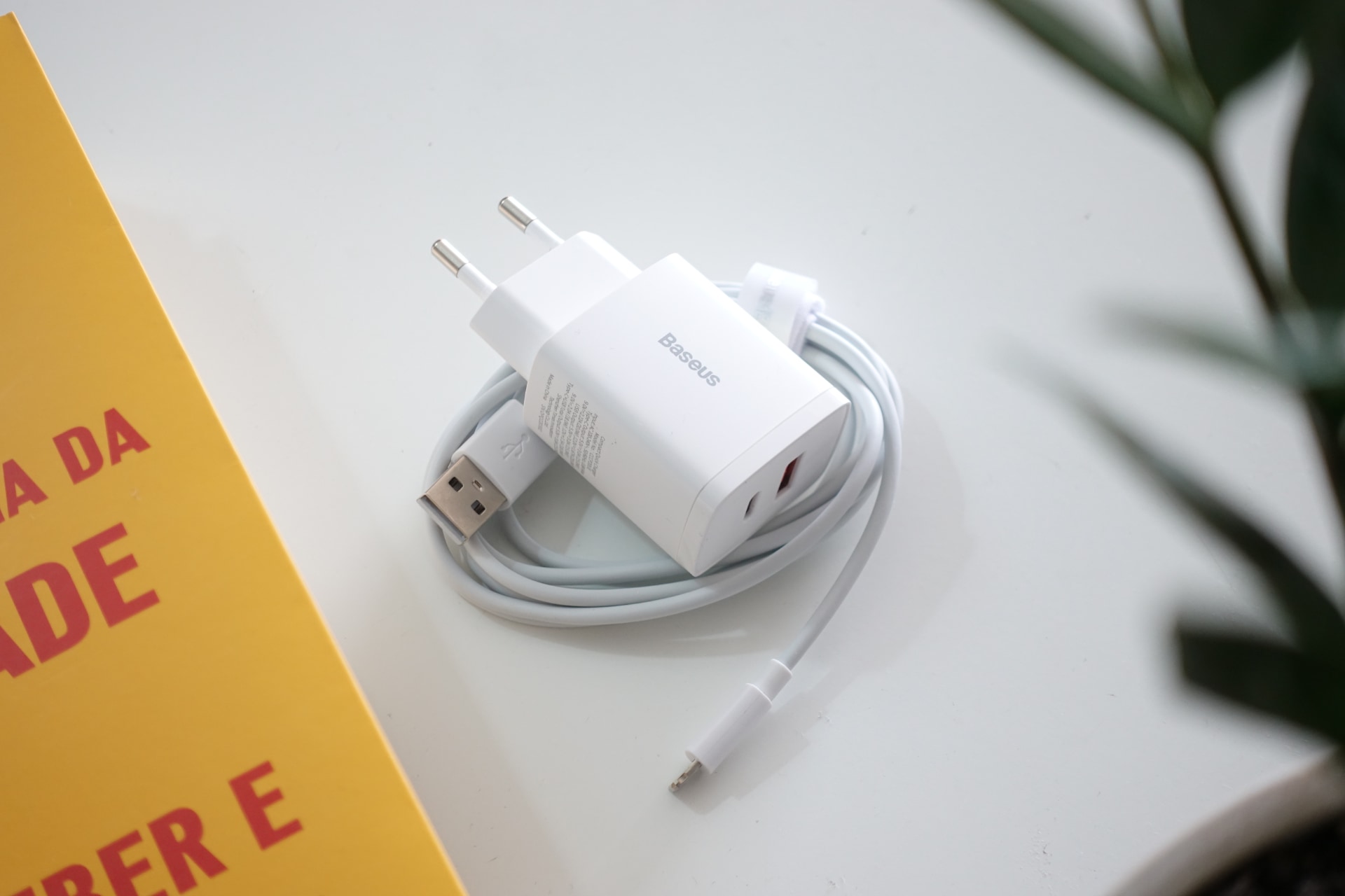
I opted for an alternative, from a brand called Baseus, which comes with a Lightning cable, at a lower price than Apple’s solo charger.
Alongside a few others brands, such as Ugreen and Anker, these Chinese companies have been filling the gaps created by Apple and followed, in parts, by other manufacturers — it’s starting to get hard to find chargers inside Android phone boxes.
The cost-effectiveness of alternative brand accessories is great not because they are the cheapest (they are not), but because they are cheaper than the official ones and often better.
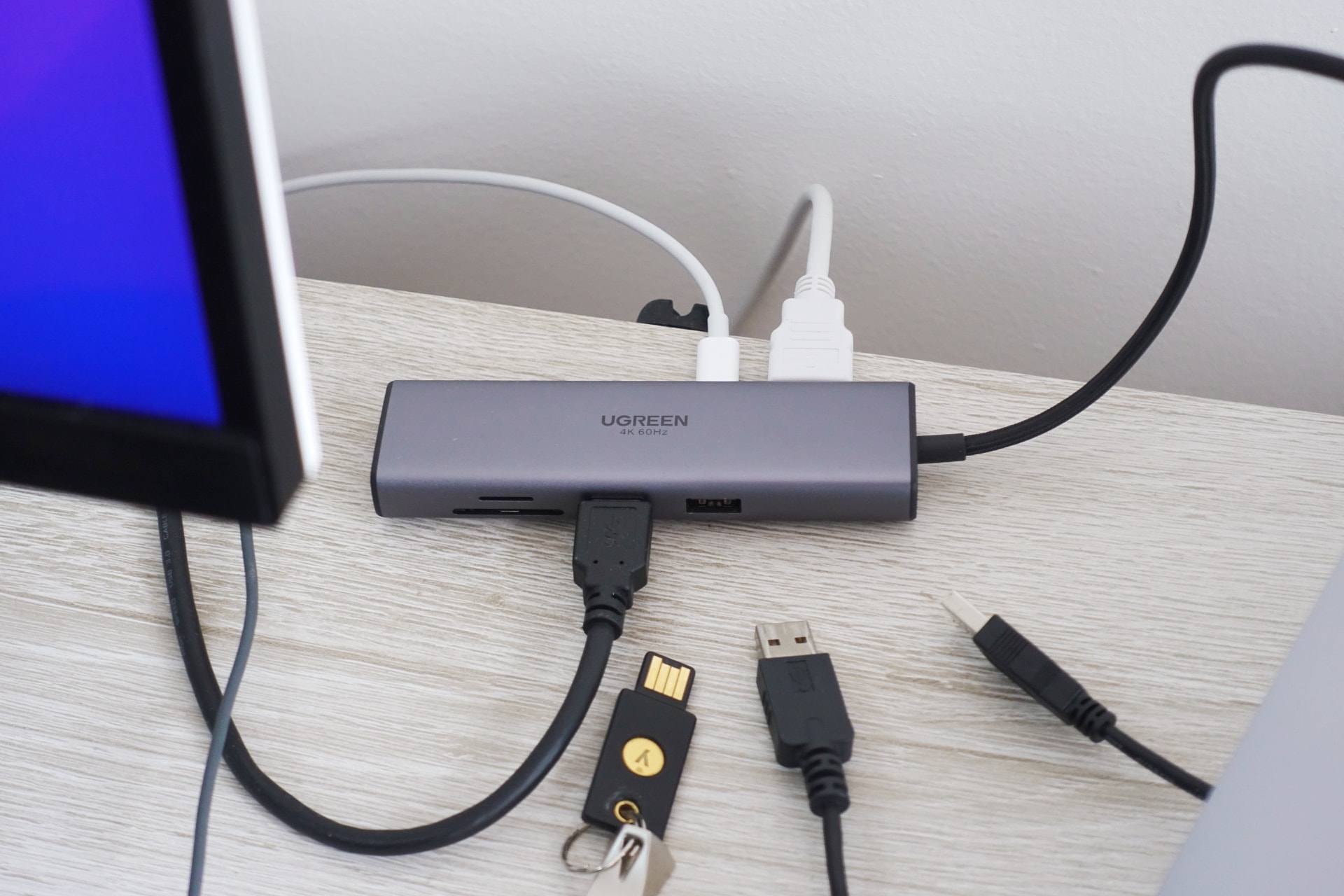
Apple’s “multi-port adapter” costs USD 69 at its official store and expands a USB-C to a trio of ports — USB-C, HDMI and USB-A. For 1/3 of this price I bought a USB-C hub from Ugreen without USB-C, but with two USB-A ports, HDMI, RJ-45, and SD and microSD card readers.
In any case, I would rather not to have to deal with it. It’s not an unreasonable wish. The laptop I bought in 2015 and the phone of 2017 were “self-contained,” they both came with all the ports and essential accessories out of the boxes.
Too often companies sell ideas of “progress” that are actually setbacks, but with such good marketing that they pass as such. For these two cases, the laptop without ports/connections and the phone without charger in the box, there is no explanation, fanciful or otherwise, that is at least convincing.
Discuss @ Hacker News.
24/8/2022
In May, a post by Neeraj Arora went viral on Twitter. In that thread, he told how he was duped by Mark Zuckerberg in 2014, when the then Facebook bought WhatsApp for USD 22 billion. Neeraj was the chief business officer of the messaging startup and was directly involved in the sale to Facebook.
The unfolding of that story is known by now: Zuckerberg violated some of the commitments he made in 2014 to WhatsApp’s founders, such as not cross-referencing WhatsApp users’ data with that of other properties, and the founders eventually left the company while WhatsApp continued to grow into one of humanity’s leading communication engines.
Neeraj hasn’t given up on his dream of creating a better app, however. In that Twitter thread, he said that WhatsApp has become “a shadow of the product we poured our hearts into, and wanted to build for the world.” Today, he is focused on HalloApp, a sort of “second act” — this time, proofed against multibillion-dollar takeovers by companies of questionable reputation.
Origins
HalloApp was launched in November 2020, almost a year after the startup was founded by Neeraj and Michael Donohue, another former WhatsApp employee.
The app is free and available for Android and iOS. Neeraj promises that it will never have ads, algorithms, bots, or influencers. (In his Twitter photo, he wears a T-shirt with a forbidden sign over the word “algorithm”.)

HalloApp defines itself as “the first real relationship network.” I asked, in an email interview, what that means — after all, it’s not like we’re talking (only) to robots, influencers, or the wall on Twitter or Instagram.
“HalloApp was built with the purpose of connecting you with people you actually know in your life — hence we used the phone’s address book to get started,” he explained. “On other social apps, you see ads, sponsored content, friend requests from people you don’t know, and other content you usually see in a magazine or TV.”
How does it work?
Using orange as its main color and a simple interface based on four tabs and a big button for posting content, HalloApp is really a mixture of WhatsApp and Instagram.
In the WhatsApp-like realm, there are one-on-one and group chats, standard and mandatory end-to-end encryption, audio and video calls and audio messages.
In the feed, the part that resembles Instagram, one can post photos, videos, text messages, audios and, a recent addition, “moments”, photos that disappear within 24 hours and can only be seen by contacts once.
Posts on the HalloApp feed expire after 30 days, when they go into an “archive” accessible only by the author.
Contacts? Only those in your phone’s address book — that’s the only kind of data HalloApp collects, Neeraj points out. “The world is moving towards a place where the users are surveillance free and are not tracked all the time to be able to target them ads”, he says.
The focus and incentives that are more aligned with the well being of users than advertisers are felt in the app. It is very light and has few settings, all of them clear and straightforward, a sharp contrast to the endless mazes that ad-dependent networks like Facebook, Instagram, and Twitter call “settings”.
Overall, it’s a very nice experience, but what are the chances of something like this taking hold in 2022?
No rivalry
When I asked Neeraj this question, I mentioned HalloApp’s obvious rivals: WhatsApp and Instagram. He dismissed the issue, saying that “we didn’t create HalloApp to rival some other app. We just want to create an experience that is new, private and clutter free”.
The last part draws attention in light of the national elections across the world and the recurring and serious troubles other social platforms get involved regarding misinformation, hate speech, and other speech issues.
“We have some inherent benefits because of the way HalloApp is built”, says Neeraj after I ask if HalloApp is prepared for these challenges.
“We don’t have a concept of a public post that can be sent or viewed by millions of people. So this minimizes the chances of spreading misinformation. Secondly, we don’t allow for searching a profile and sending them friend requests, so this adds to the safety on the network. It is tough to prevent bad behaviour on any product, but we can always build products that are safe and responsible.”
We had our first conversation in February. At some point since then, HalloApp got a feature that allows you to expose content to third parties — a share with the outside world (example).
When I resumed my conversation with Neeraj at the end of July, Instagram was under heavy criticism due to its “tiktokzation” process. I then asked him if he saw this event as an opportunity to promote HalloApp.
Again, the answer was “no”: “We want to focus on our own values — that is to help you stay in touch with people that you care about in an authentic and private experience.”
Business model and global scale
Neeraj utters strong words when talking about Meta, the fate of WhatsApp, and the virtues of HalloApp, but is that enough to trust this new, cool app?
Despite the distinctions and the aspiration to become a global app, in business terms HalloApp is quite conventional: it’s funded by venture capital and its apps and server code are both proprietary.
Asked whether the absence of the apps’ source code availability might be a loophole in HalloApp promise of privacy, Neeraj confessed that he hadn’t thought about it, but didn’t rule out opening it up in the future.
As for the business model, HalloApp knows what it doesn’t want (ads) and what it does want — in this case, paid features.
The first trials should start in early 2023. In our conversation, Neeraj didn’t reveal details, but in an interview with Protocol in May, he referred to WhatsApp’s original business model as “a taste” of alternative methods to generate revenue in this space.
In case you don’t remember, WhatsApp used to charge a USD 1 annual fee from users in the United States and a few European countries. From the Protocol interview, Neeraj’s words:
In users’ mindset, they don’t mind paying for products that they love if it is nominal and it serves the needs they have. We haven’t really pinpointed exactly how our subscriptions will work, but broadly, we are thinking of having a product which will be free for everyone to use and then we will build a set of premium features on top and you can upgrade to a subscription, a monthly subscription, and pay for this.
It’s a model that other social networks and messaging apps, such as Snapchat, Twitter and Telegram, are already experimenting with.
Neeraj won’t give HalloApp’s numbers, only that there are 15 people working on the startup.
The goal is to gain scale and become a global app, such as WhatsApp already is, and although HalloApp is slowly but steadily releasing new features, it is hard to see it gaining traction anytime soon. According to consulting firm Sensortower, in July HalloApp had 100,000 downloads for Android and less than 5,000 for iOS.